PCA and Biplot using Python
There are several ways to run principal component analysis (PCA) using various packages (scikit-learn, statsmodels, etc.) or even just rolling out your own through singular-value decomposition and such. Visualizing the PCA result can be done through a biplot. I was looking at an example of using prcomp and biplot in R, but it does not seem like there is a comparable plug-and-play way of generating a biplot with Python.
As it turns out, generating a biplot from the result of PCA by pcasvd of StatsModels is fairly straightforward from the rotation matrix supplied by the function. Here is a code snippet (which is also available in Gist):
#!/usr/bin/env python2.7
# -*- coding: utf-8 -*-
"""Biplot example using pcasvd from statsmodels and matplotlib.

This is an example of how a biplot (like that in R) can be produced
using pcasvd and matplotlib. Additionally, this example does k-means
clustering and color observations by which cluster they belong to.

"""
import matplotlib.pyplot as plt
import numpy as np
import pandas as pd
from scipy.cluster.vq import kmeans, vq
from statsmodels.sandbox.tools.tools_pca import pcasvd


def biplot(plt, pca, labels=None, colors=None,
           xpc=1, ypc=2, scale=1):
    """Generate biplot from the result of pcasvd of statsmodels.

    Parameters
    ----------
    plt : object
        An existing pyplot module reference.

    pca : tuple
        The result from statsmodels.sandbox.tools.tools_pca.pcasvd.

    labels : array_like, optional
        Labels for each observation.

    colors : array_like, optional
        Colors for each observation.

    xpc, ypc : int, optional
        The principal component number for x- and y-axis. Defaults to
        (xpc, ypc) = (1, 2).

    scale : float
        The variables are scaled by lambda ** scale, where lambda =
        singular value = sqrt(eigenvalue), and the observations are
        scaled by lambda ** (1 - scale). Must be in [0, 1].

    Returns
    -------
    None.

    """
    xpc, ypc = (xpc - 1, ypc - 1)
    xreduced, factors, evals, evecs = pca
    singvals = np.sqrt(evals)

    # data
    xs = factors[:, xpc] * singvals[xpc]**(1. - scale)
    ys = factors[:, ypc] * singvals[ypc]**(1. - scale)

    if labels is not None:
        for i, (t, x, y) in enumerate(zip(labels, xs, ys)):
            c = 'k' if colors is None else colors[i]
            plt.text(x, y, t, color=c, ha='center', va='center')
        xmin, xmax = xs.min(), xs.max()
        ymin, ymax = ys.min(), ys.max()
        xpad = (xmax - xmin) * 0.1
        ypad = (ymax - ymin) * 0.1
        plt.xlim(xmin - xpad, xmax + xpad)
        plt.ylim(ymin - ypad, ymax + ypad)
    else:
        colors = 'k' if colors is None else colors
        plt.scatter(xs, ys, c=colors, marker='.')

    # variables
    tvars = np.dot(np.eye(factors.shape[0], factors.shape[1]),
                   evecs) * singvals**scale

    for i, col in enumerate(xreduced.columns.values):
        x, y = tvars[i][xpc], tvars[i][ypc]
        plt.arrow(0, 0, x, y, color='r',
                  width=0.002, head_width=0.05)
        plt.text(x* 1.4, y * 1.4, col, color='r', ha='center', va='center')

    plt.xlabel('PC{}'.format(xpc + 1))
    plt.ylabel('PC{}'.format(ypc + 1))


def main():
    """Run a PCA on state.x77 from R and generate its biplot. Color
    observations by k-means clustering."""
    df = pd.io.parsers.read_csv('data/state.x77')
    print df.describe()
    print df.head()

    columns = ['Population', 'Income', 'Illiteracy',
               'Life Exp', 'Murder', 'HS Grad']

    data = df[columns]
    data = (data - data.mean()) / data.std()
    pca = pcasvd(data, keepdim=0, demean=False)

    values = data.values
    centroids, _ = kmeans(values, 3)
    idx, _ = vq(values, centroids)

    colors = ['gby'[i] for i in idx]

    plt.figure(1)
    biplot(plt, pca, labels=data.index, colors=colors,
           xpc=1, ypc=2)
    plt.show()


if __name__ == '__main__':
    main()
In addition to PCA, $k$-means clustering (three clusters) was run on the data to color the observations by how they cluster. The resulting biplot for states.x77 (which I exported and borrowed from R) looks like this:
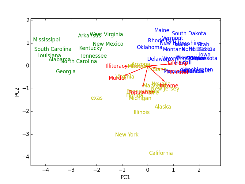
Figure 1: Biplot